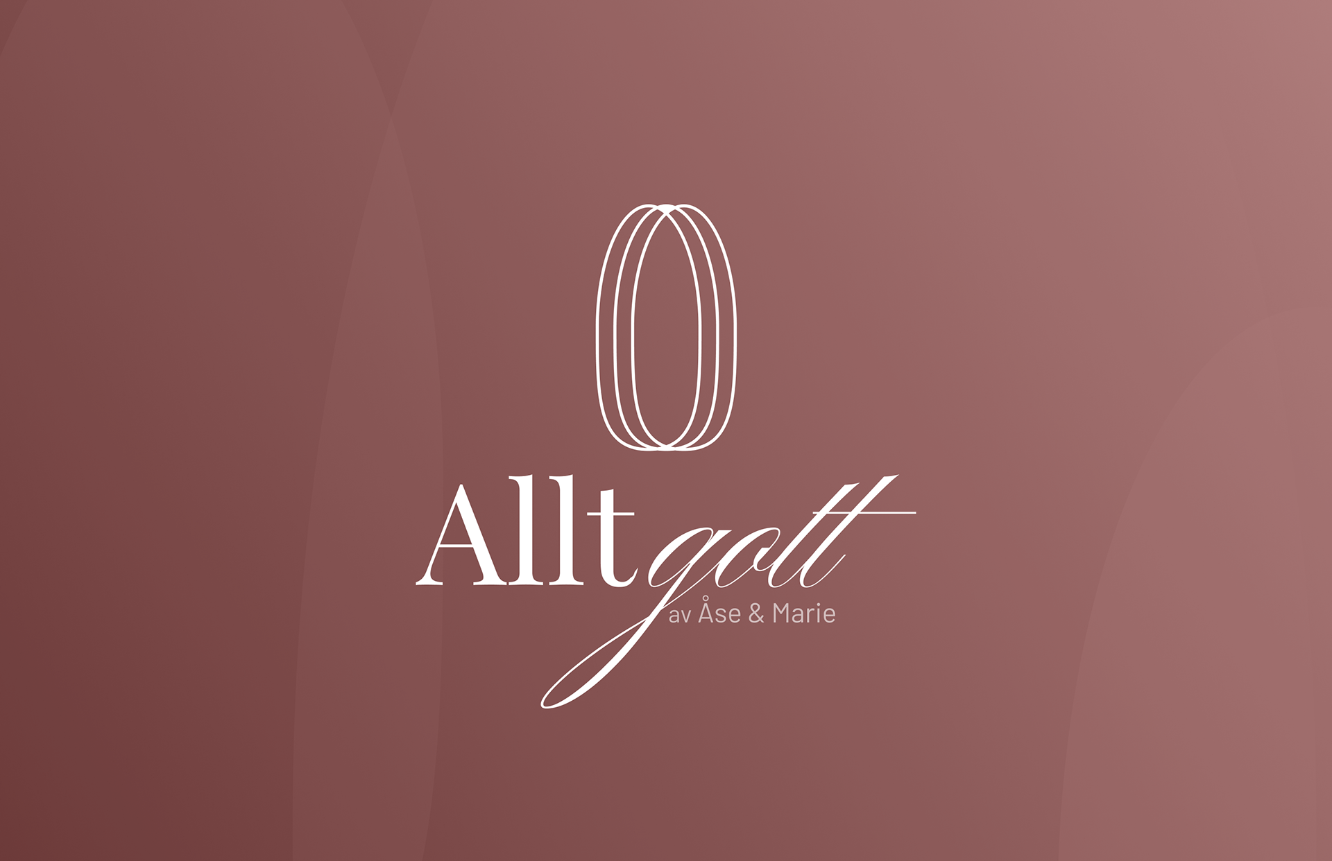
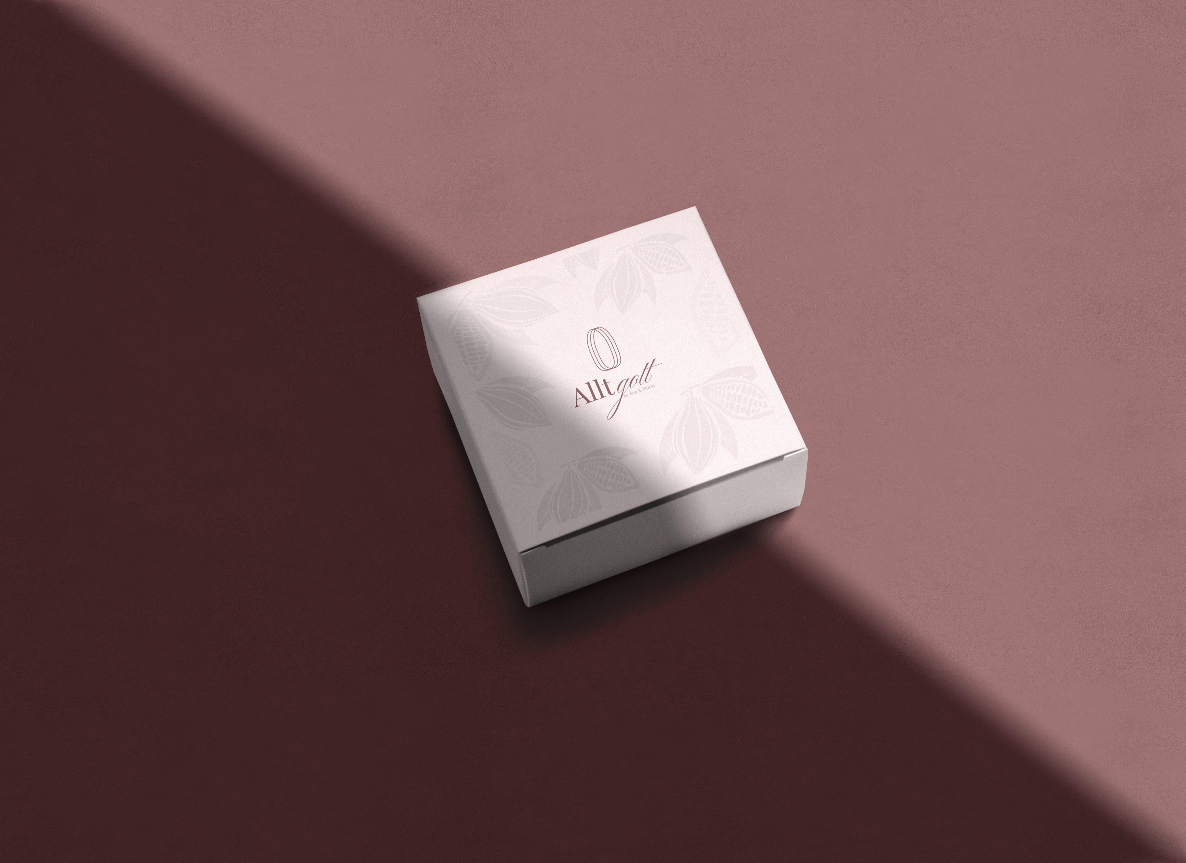
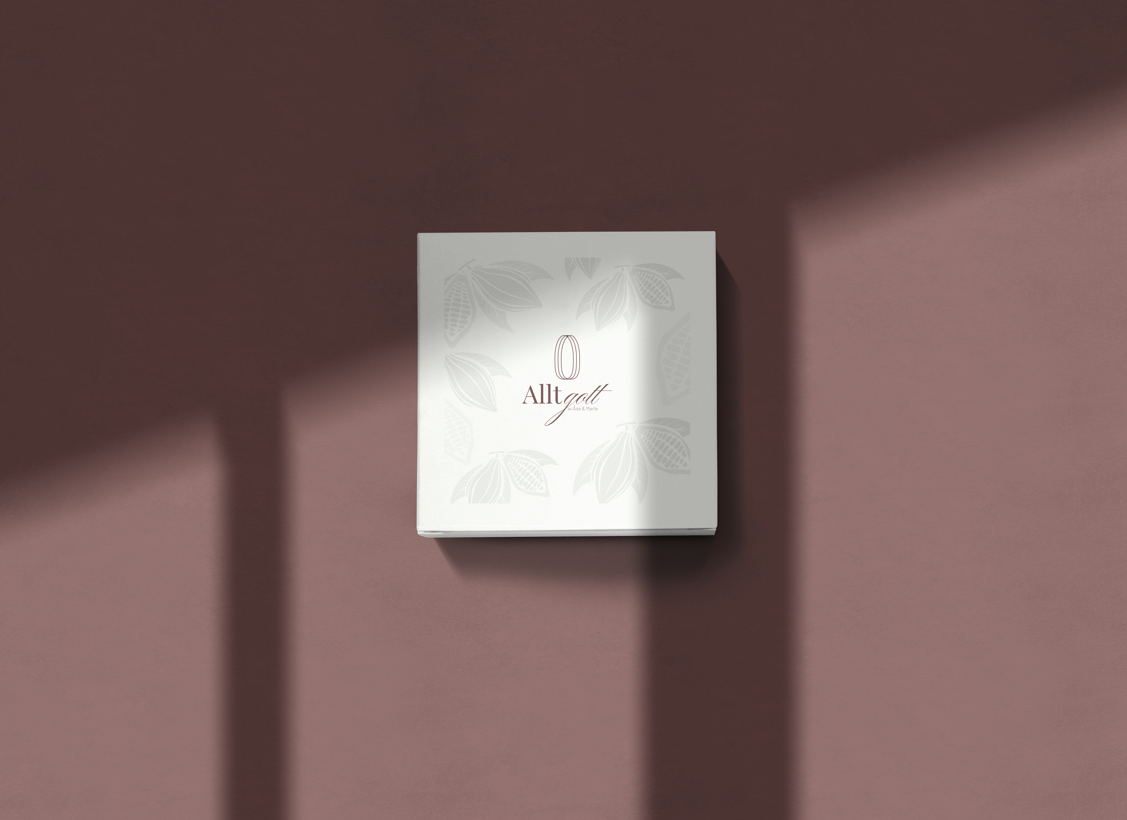
Colors
The colors used for this project is a mix of a light mauve mixed with a muted reddish brown, since the company is dealing with chocolate, I created a color scheme that mirrored that while giving it a modern look. The result is Allt Gott Gradient, a colorful, warm and luxurious color scheme with the intent to stand out on the market.
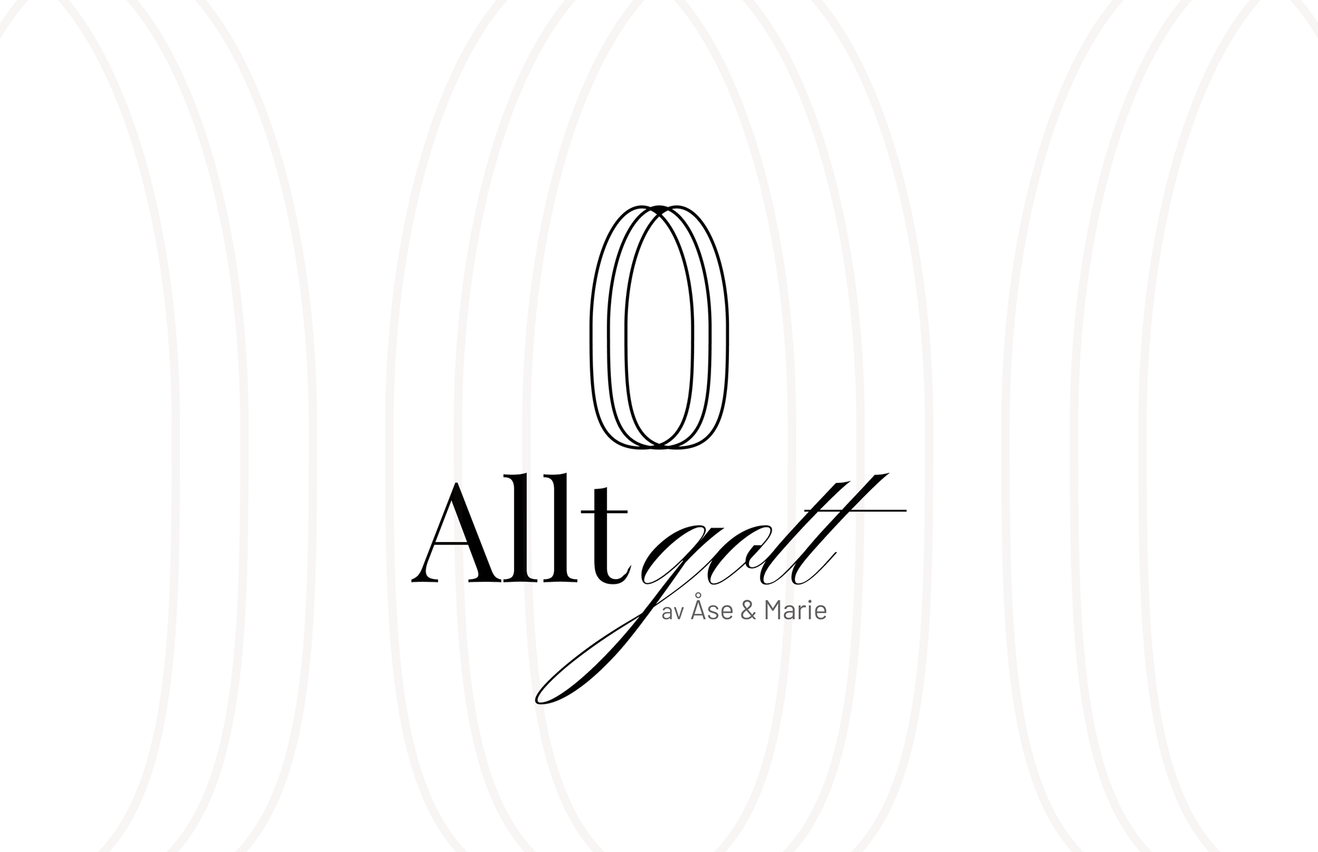
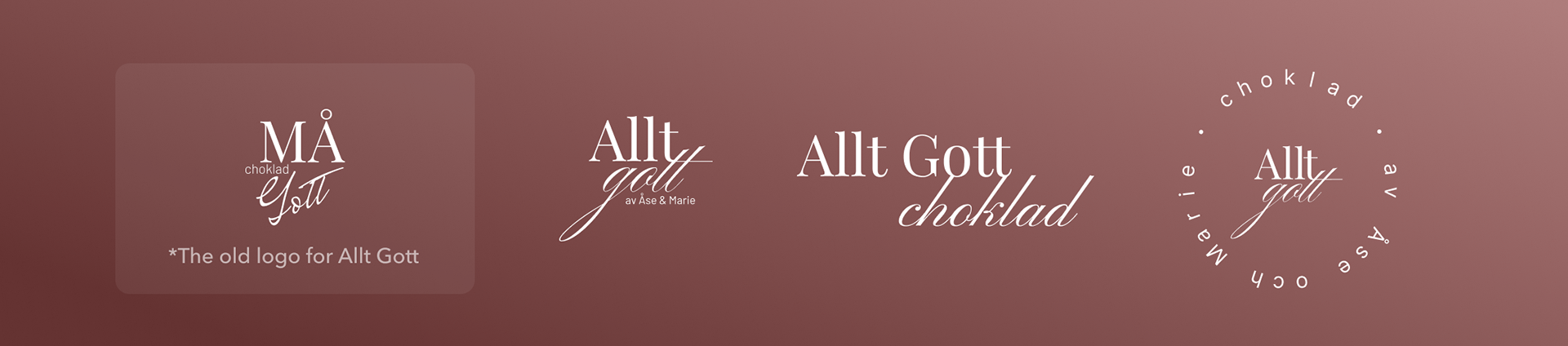
The Logo
The logo development started off with the idea of a mixed typography styled logo. The all typography logo looked good but in an attempt to make it more livley I created some icons to symbolise the cacao bean. One of the main component behind all the products of Allt Gott.
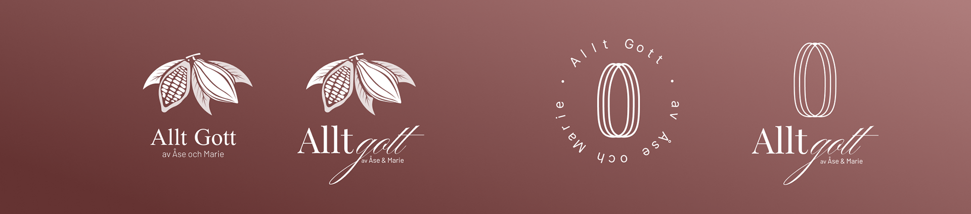
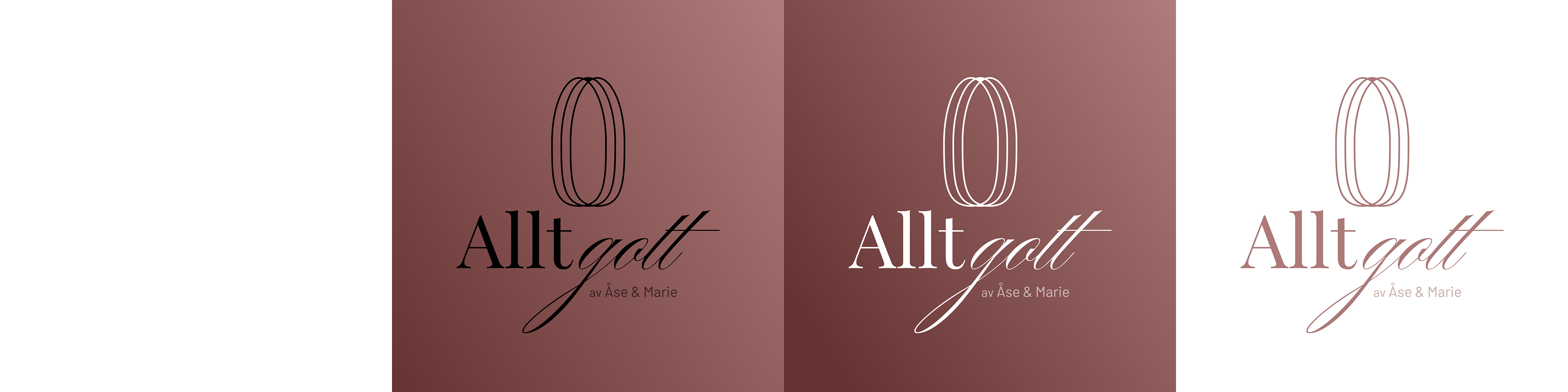
The final is a typographic logo that can be used on it's own when needed, but the complete logo comes with a modern abstract illustration of a cacao bean.
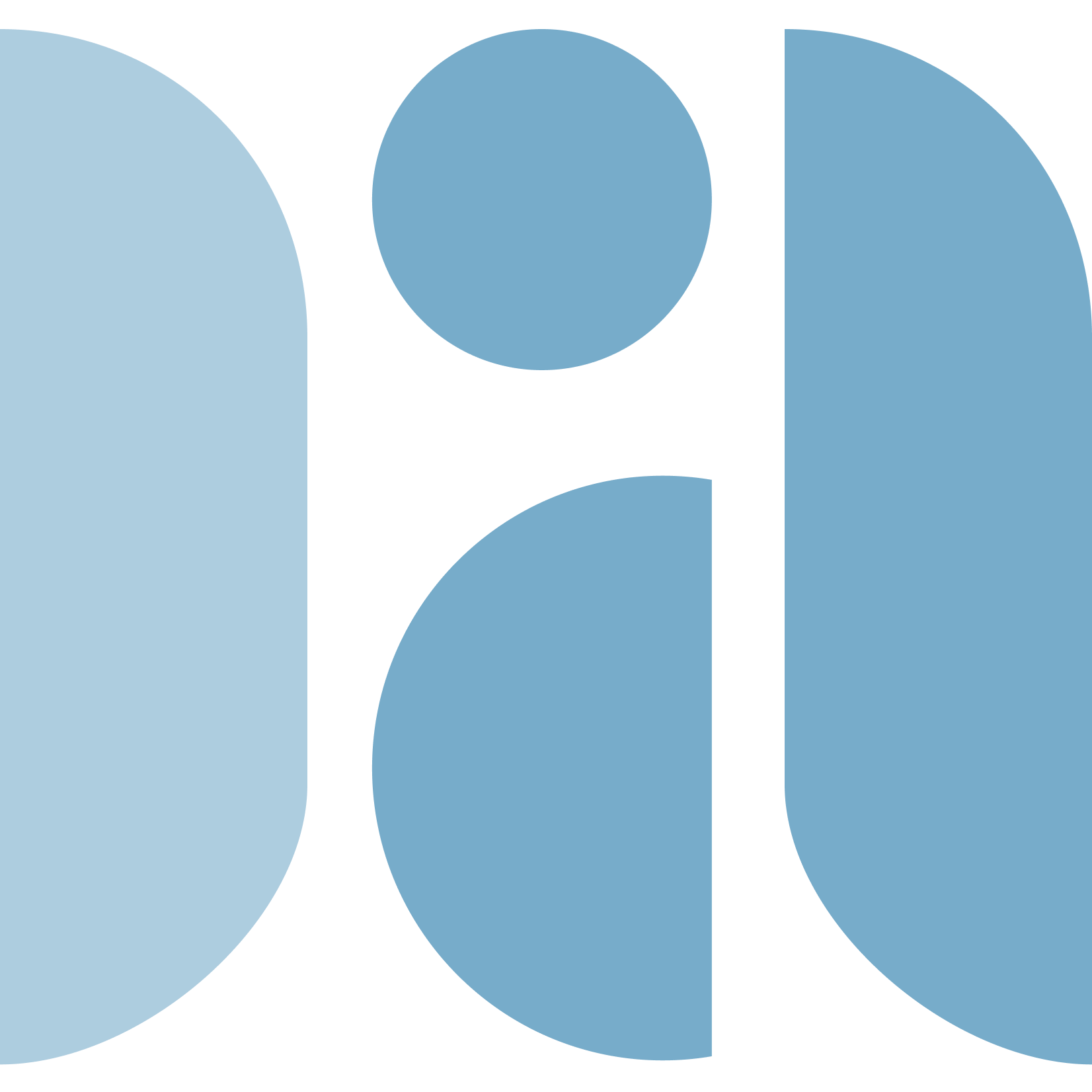
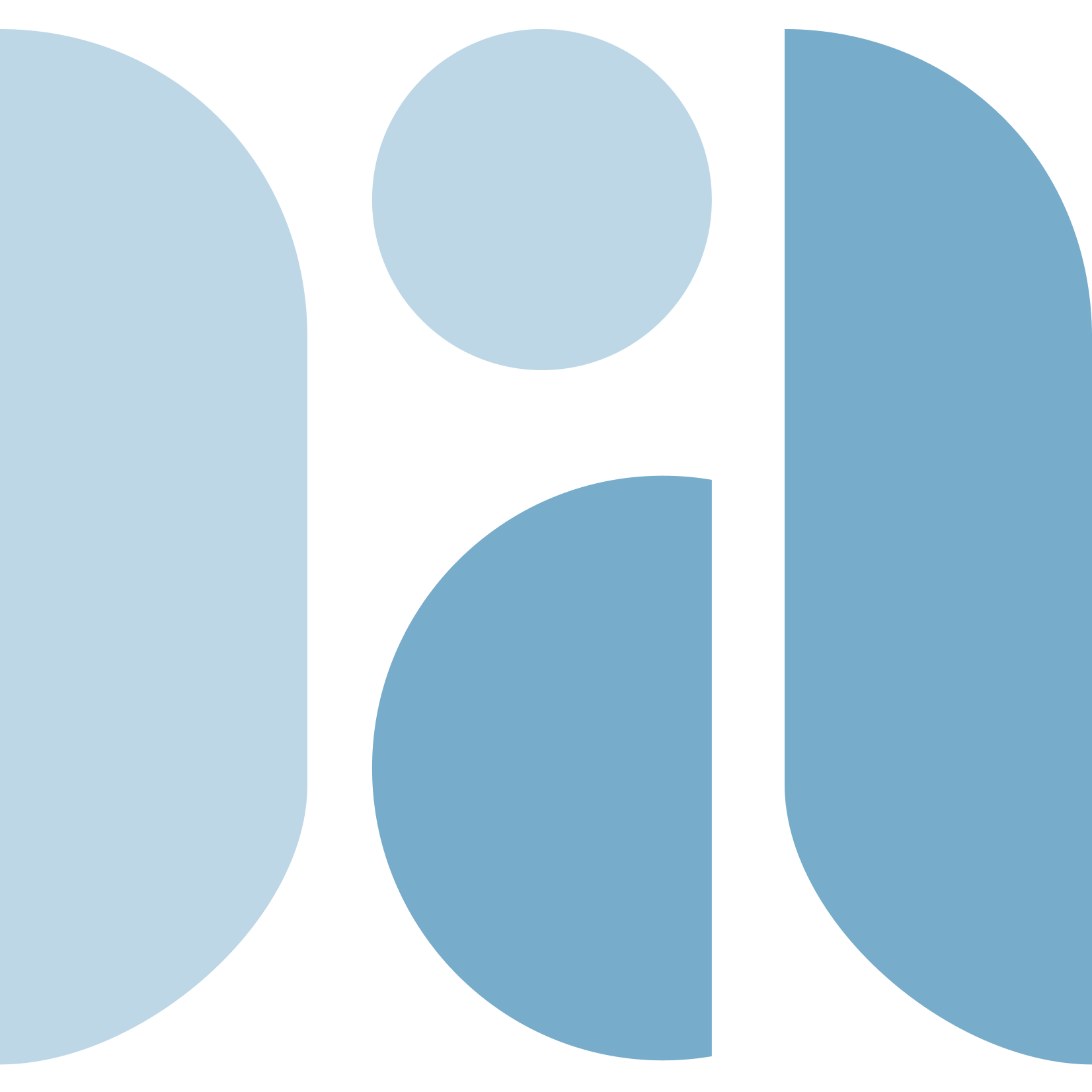
Patterns
After creating the final logo I created two different patterns based on the logo that can be used interchangeably. One is modern with the oval shapes on top of the Allt Gott Gradient. The second one is an art deco style pattern with the geometric icon expanded, muted and repeated.