Design Digest
For Design Digest, the task was to use different design styles for different words. Also coming up with concepts to support our design choices and putting them into context all within a limited timeline. This taught us how to work effectively under pressure and to go wild with our creativity.
For Design Digest, the task was to use different design styles for different words. Also coming up with concepts to support our design choices and putting them into context all within a limited timeline. This taught us how to work effectively under pressure and to go wild with our creativity.

water - We as humans are attracted to beautiful and colorful things. So I created a design inspired by colorful oil spills in our waters, that might look beautiful but is deadly. A reminder that we need to take care of our water.
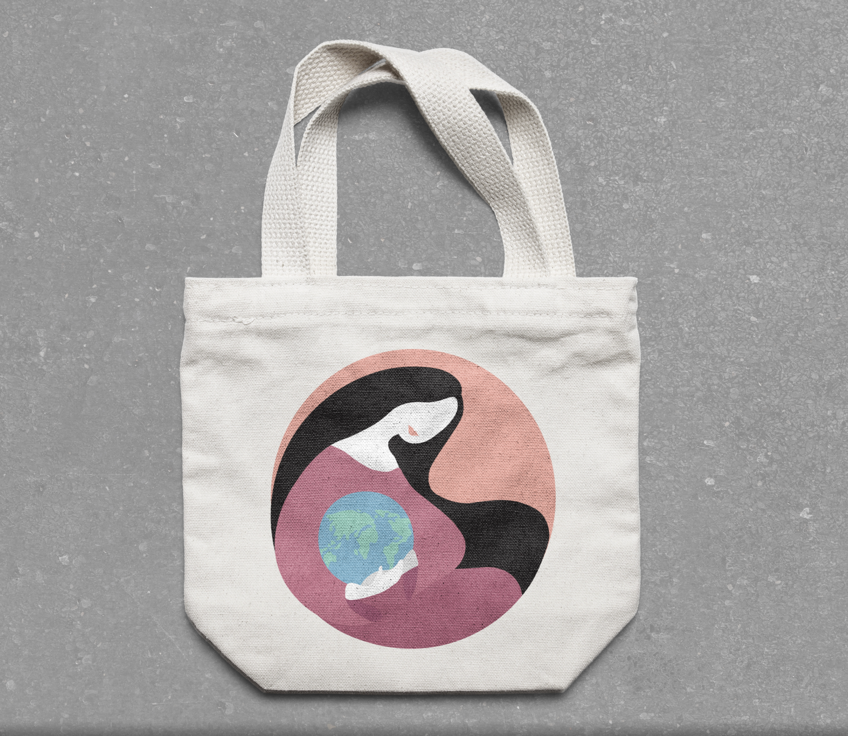
Responsibility - I created a print of patcha mama (earth godess). For this design to not be contradictory I needed something that would leave a positive impact on the environment, therefore this print is on a reusable tote bag.

Bad - Ever heard learning by mistakes? This brochure was made to look good to an untrained eye, but anyone with a design education will know about the hidden design mistakes. This project was created to work as a advertisement for Marbella Design Academy.
Viva la Fería
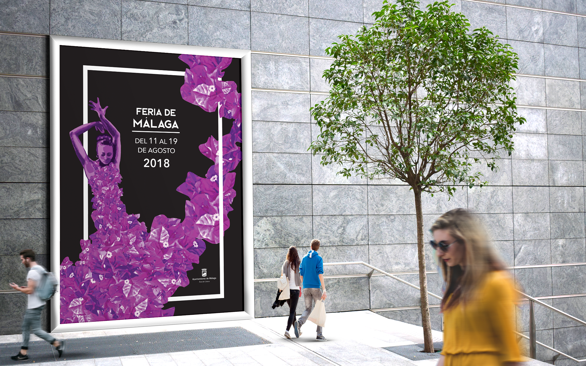
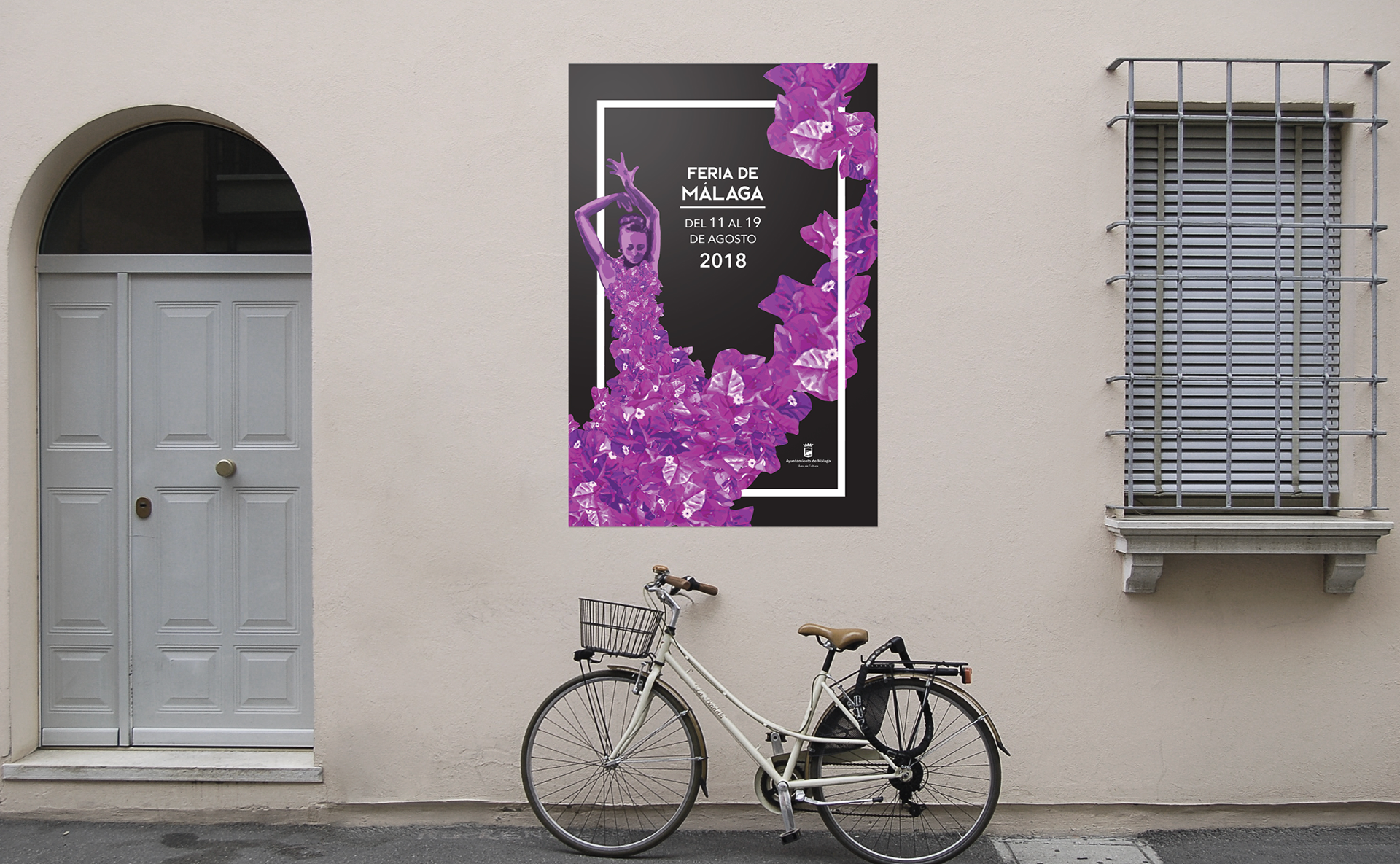
For Viva la fería the challange was to create a poster for the Málaga fería. The final outcome was a minimalistic poster featuring the traditional Andalusian flamenco dancer and the beautiful iconic flowers, boganvillas.
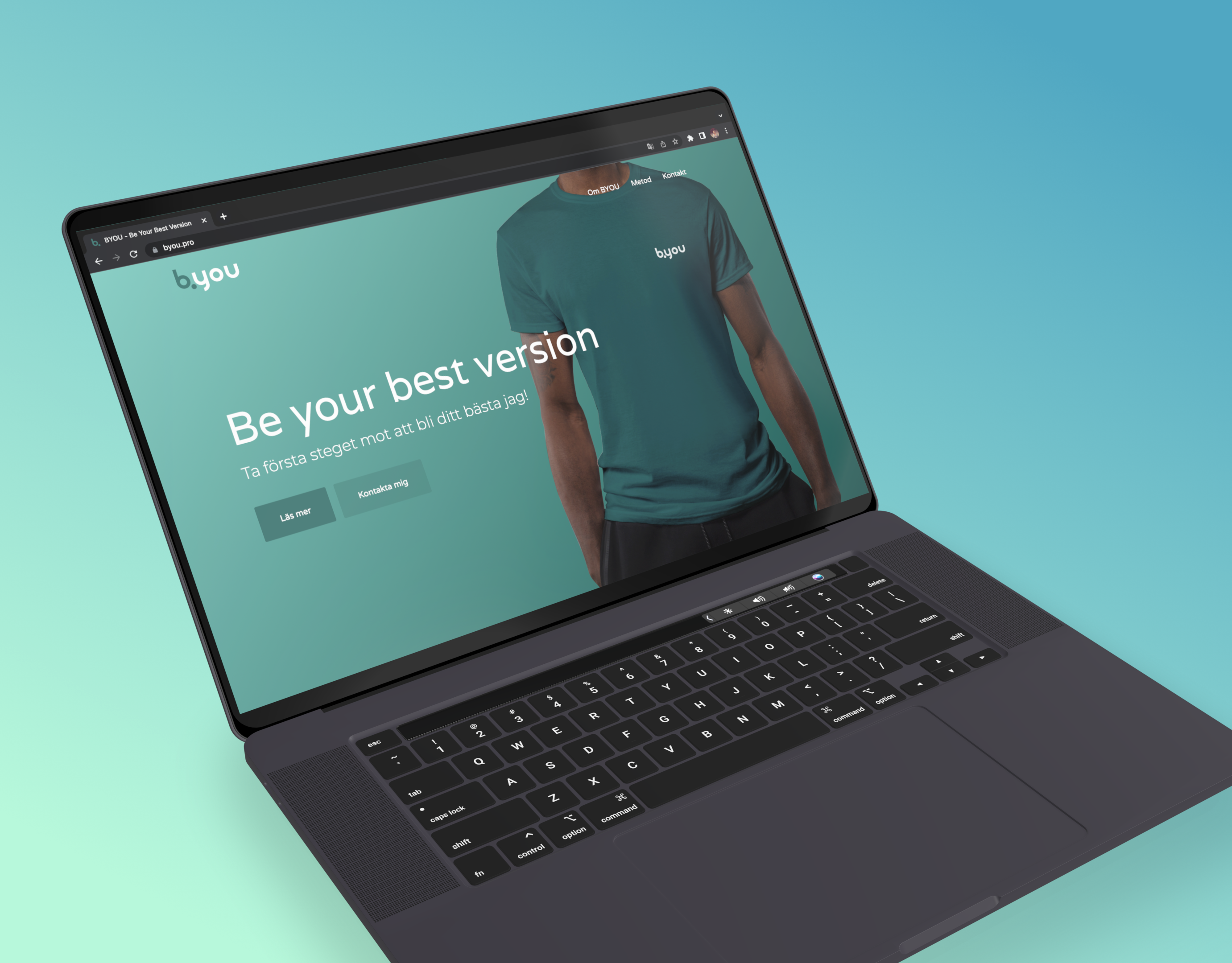
Get Yourself An Education
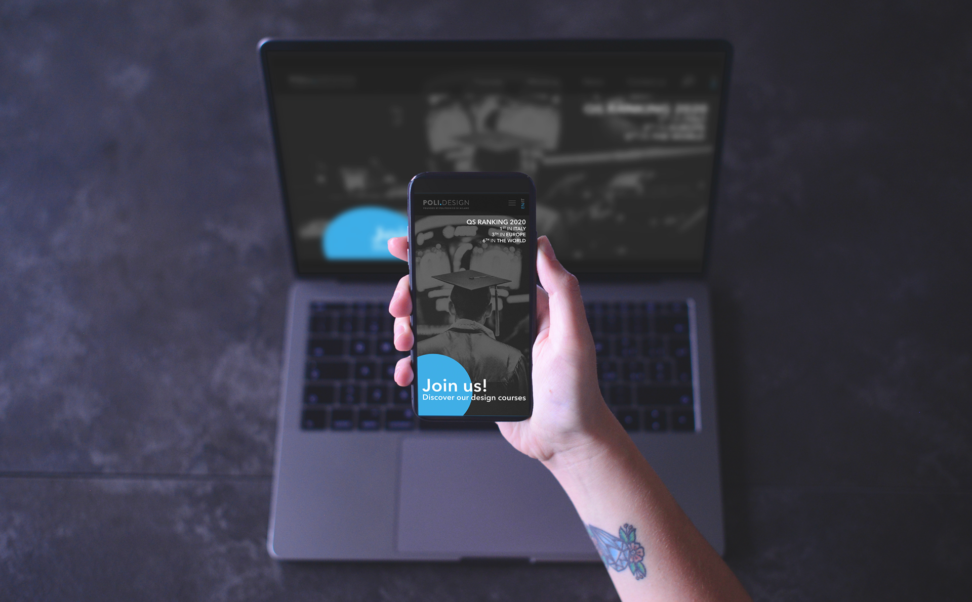
For this project, we were tasked with redesigning a design related university website, but we were not allowed to change the logo. My final outcome was a minimalistic website with circular elements that can also be found in the university logo.
Hidden Meanings
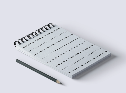
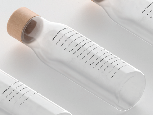
For the project hidden meanings, we had to come up with a design that was an extension or a new way of communicating by symbols. For my project, I decided to make a symbol system that could be an aid for children with reading difficulties, named Eyeline. The different patterns are designed to be remembered, so even though the eyes jump sentences or the children are distracted they can easily get back to the text thanks to the lines. Merchandise exists to help remembering the order of the Eyeline but also to gather attention to the cause.
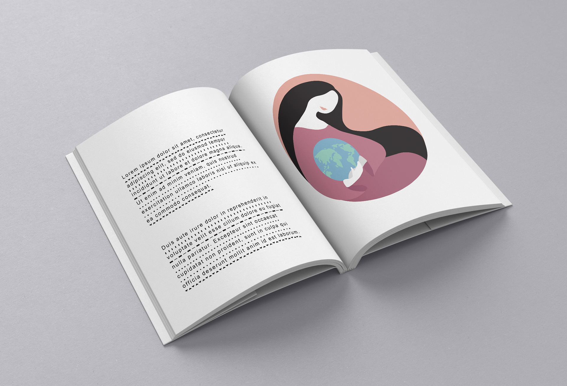
Eyeline in book
Eyeline merchandise
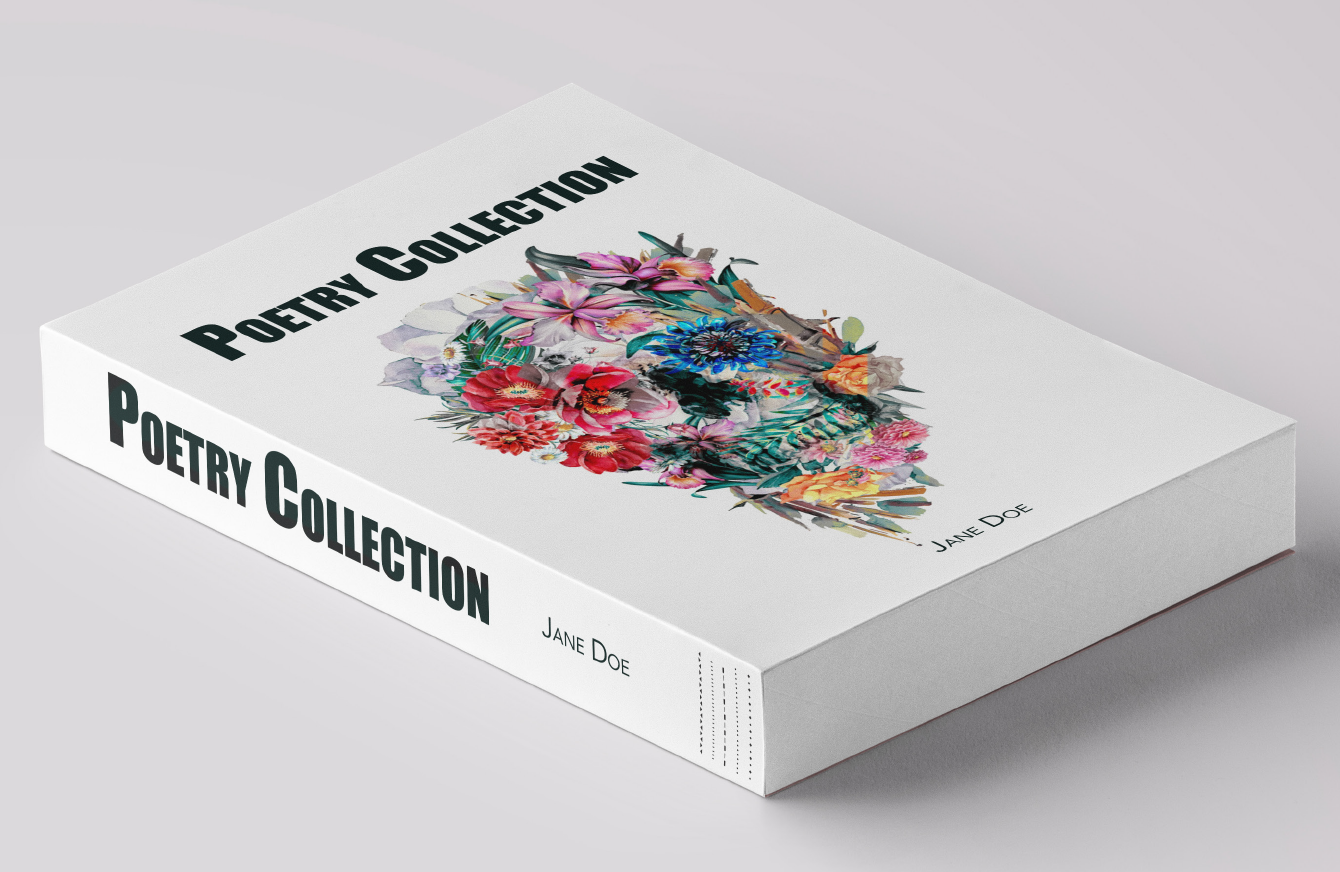
Book spine showing it contains Eyeline
Eyeline merchandise
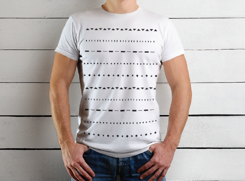
Eyeline merchandise

Eyeline memory card
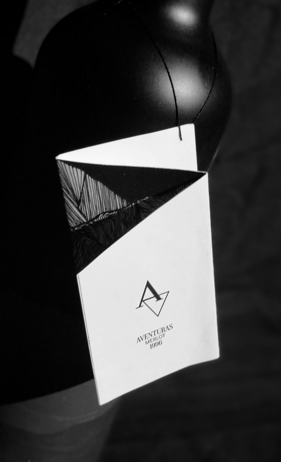
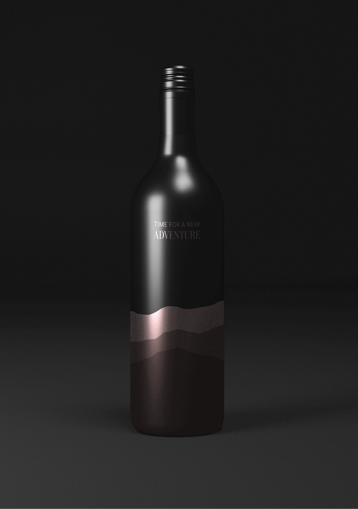
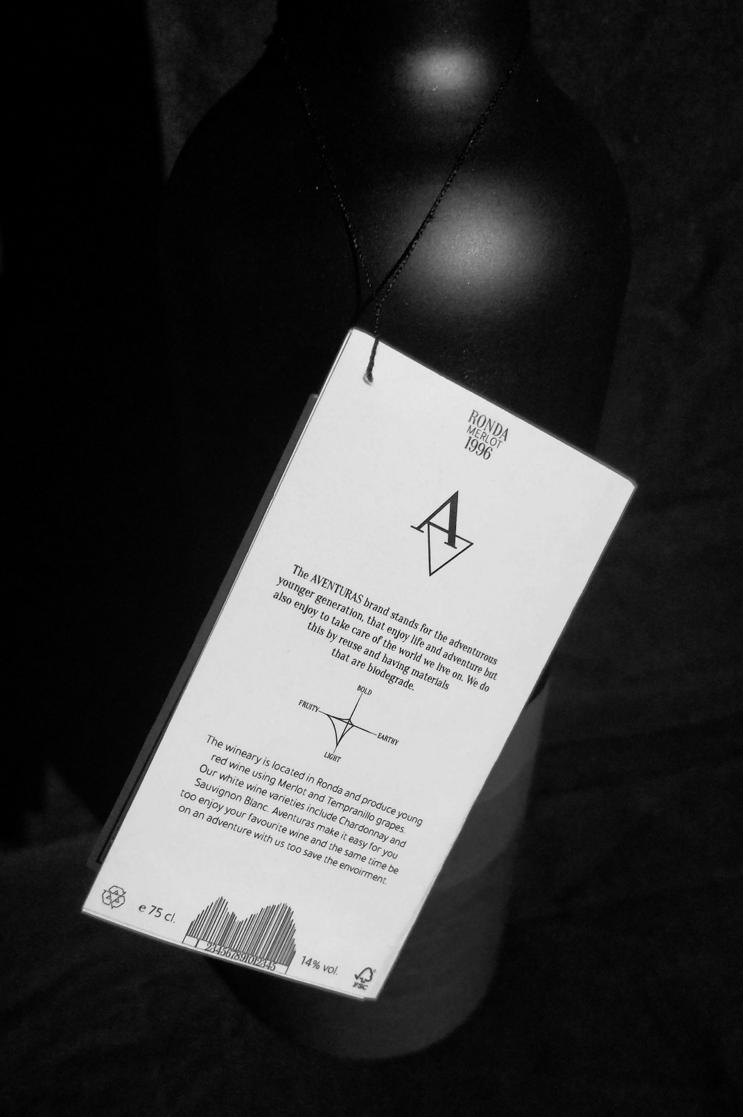
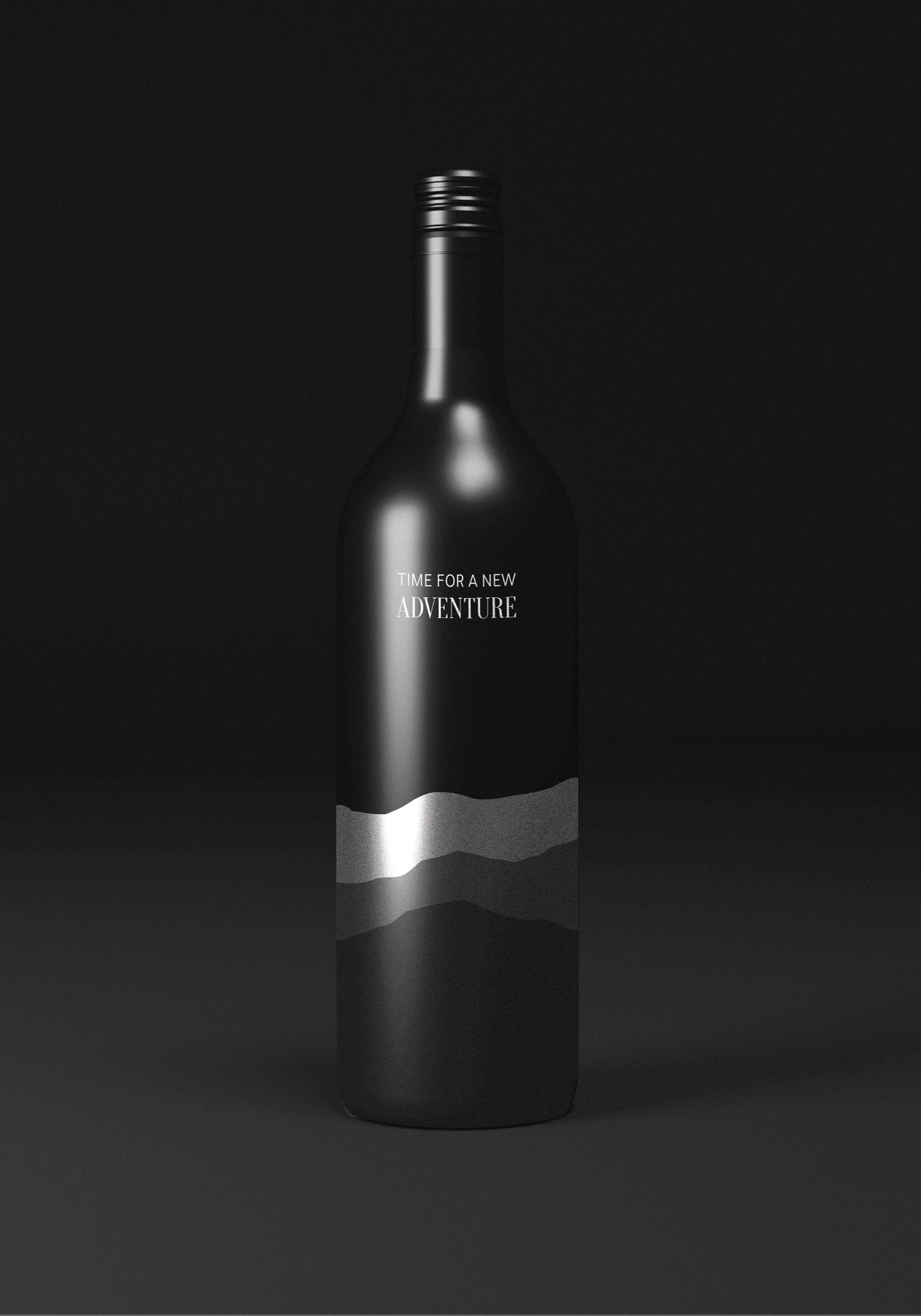
Aventuras Wine
For This project we were tasked with creating a wine brand and packaging. The brand Aventuras was created and the design is focused on zero-waste refill bottles. Therefore an attached etiquette with all information was created instead of printed directly on the bottles. So you can just refill your Aventuras wine bottle at the closest bulk store, and avoid plenty of packaging waste.


VeryVegan
For this project I was tasked with creating an application that targets a social issue. The final result was a minimalistic colorful app and website for vegan food that is meant to inspire more people to eat vegan.

Pull up banner
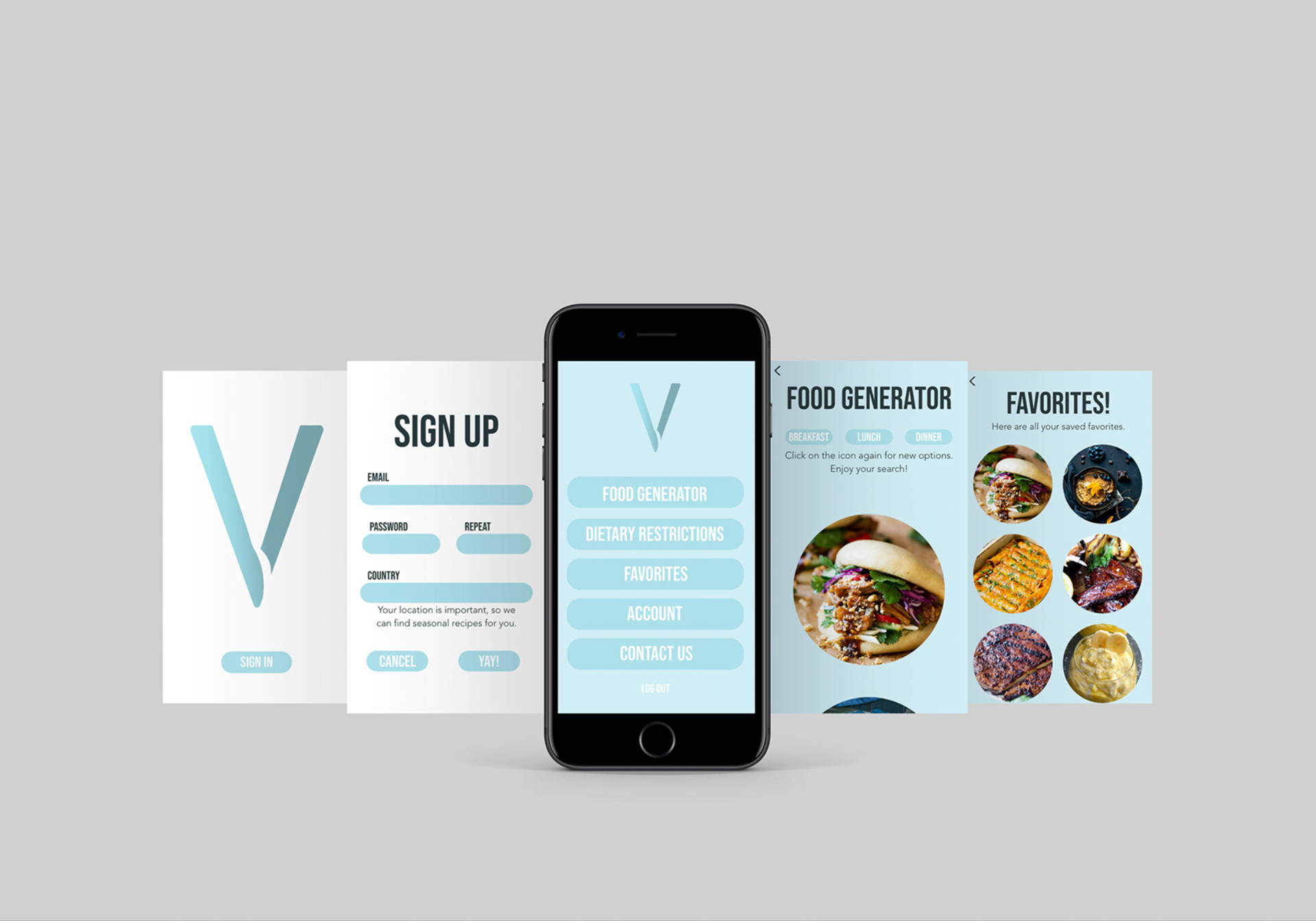
Highlights of the application